Chapter 20 Linear regression in R
This lab activity is adapted from the R for Data Science book.
In this lab activity, we step through the rationale for linear regression.
20.1 Dependencies and setup
This lab using the following packages:
- tidyverse
- modelr
- cowplot
You will need to install any that you do not have.
library(tidyverse)
library(modelr)
# The cowplot package has a nice theme for ggplot *and* all sorts of useful
# other features.
library(cowplot)
# With theme_set, we can set the default ggplot theme to be the cowplot theme.
theme_set(theme_cowplot())
20.2 Fitting a linear model to data
sim1 is a simple dataset included in the modelr package.
sim1 has two attributes: y and x.
In this lab activity, sim1 is our training data wherein y is our response variable and x is a predictor variable.
That is, we want to use linear regression to build a model that describes the relationship between our response variable, y, and our predictor variable, x.
We could then use our model to make predictions about values of y for unseen values of x.
head(sim1)## # A tibble: 6 × 2
## x y
## <int> <dbl>
## 1 1 4.20
## 2 1 7.51
## 3 1 2.13
## 4 2 8.99
## 5 2 10.2
## 6 2 11.3Let’s plot our training data:
s1_plot <- ggplot(sim1, aes(x, y)) +
  geom_point(size=3) +
  theme(
    text=element_text(size=16)
  )
s1_plot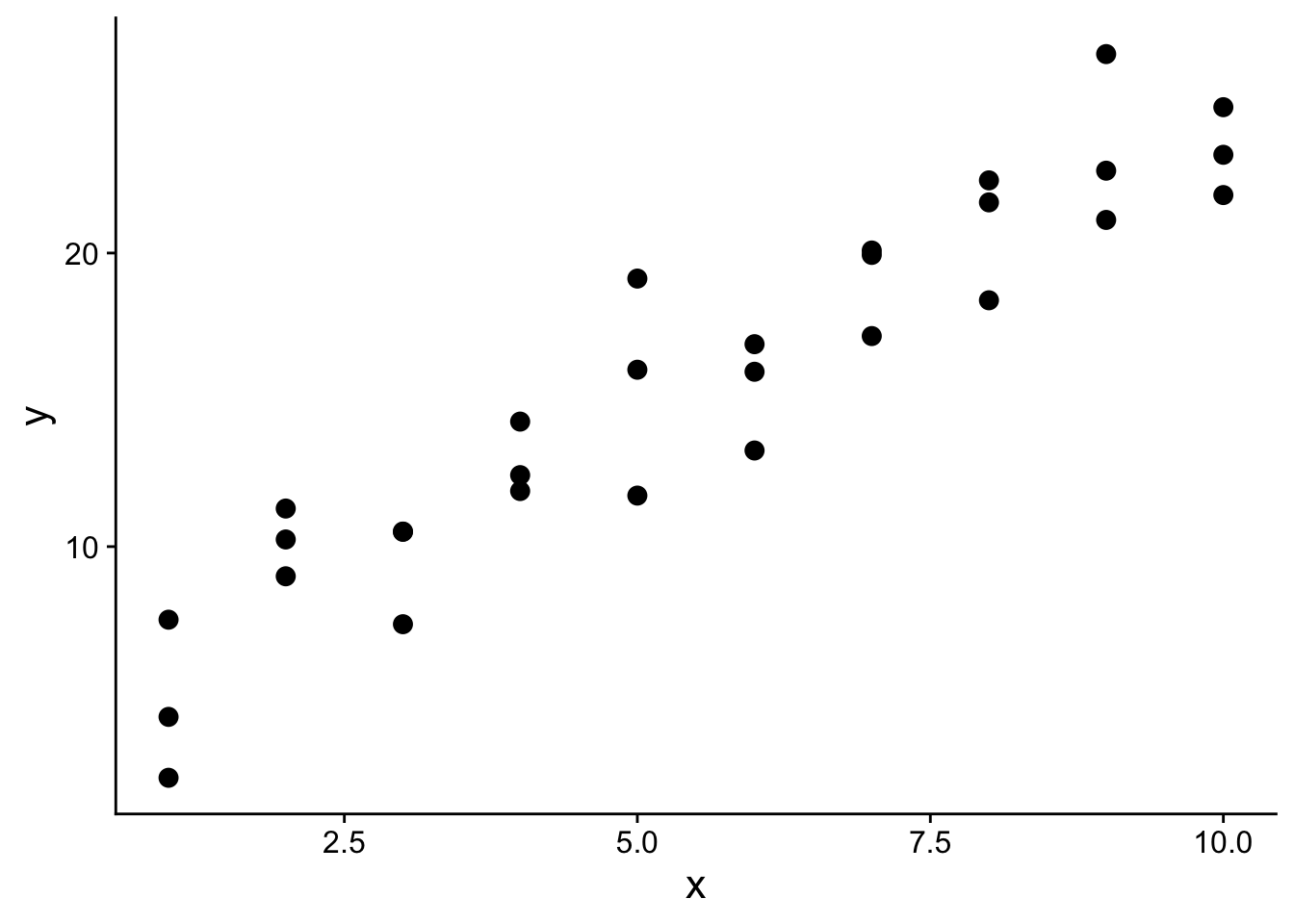
20.2.1 Random regression models
In a simple linear regression, we assume a linear relationship between our response variable y and our predictor variable x. We can describe this relationship mathematically as follows: \[y=a_2*x + a_1\]
Notice how we set up that function such that y depends on three things: the value of our predictor variable x, \(a_2\), and \(a_1\). \(a_2\) and $a_1 parameterize our linear model. That is, the values of \(a_2\) and \(a_1\) specify the particular linear relationship between x and y. \(a_2\) gives the slope of the line and \(a_1\) gives the y-intercept for the line.
Every combination of values for \(a_2\) and \(a_1\) is a different model.
For example, we could generate 500 different models for our sim1 data by generating 500 random pairs of values for \(a_1\) and \(a_2\):
models <- tibble(
  a1 = runif(500, -20, 40),
  a2 = runif(500, -5, 5)
)
head(models)
## # A tibble: 6 × 2
## a1 a2
## <dbl> <dbl>
## 1 27.9 -1.79
## 2 37.2 0.489
## 3 -16.2 2.70
## 4 6.85 -3.06
## 5 10.9 3.47
## 6 -9.04 -3.80Let’s plot all 500 of those random models on top of our sim1 data:
rand_search_plot <- ggplot(sim1, aes(x, y)) +
  geom_abline(
    data = models,
    aes(intercept = a1, slope = a2),
    alpha = 1/6
  ) +
  geom_point(
    size=3
  ) +
  theme(
    text = element_text(size=16)
  )
rand_search_plot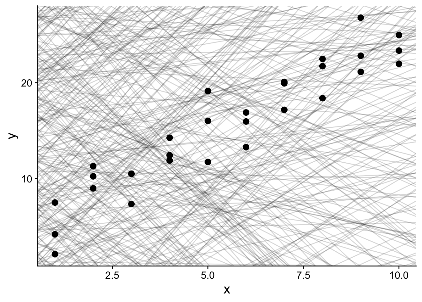
Each light gray line in the plot above is a different possible model for our sim1 data.
However, not all models are an equally good fit for our data – we generated them all randomly, so we shouldn’t have any expectation for many of them to be good!
So, we need a way to assess the quality of each model.
The function below will run our linear model with a given parameterization for \(a_1\) and \(a_2\).
# run_model <- function(a, data) {
#   a[1] + data$x * a[2]
# }
# model1(c(7, 1.5), sim1)

run_model <- function(a1, a2, data) {
  return(a1 + (data$x * a2) )
}
For example, if we wanted to run our linear model using the x values from our training data (sim1) with \(a_1=7\) and \(a_2=1.5\):
run_model(7, 1.5, sim1)## [1] 8.5 8.5 8.5 10.0 10.0 10.0 11.5 11.5 11.5 13.0 13.0 13.0 14.5 14.5 14.5
## [16] 16.0 16.0 16.0 17.5 17.5 17.5 19.0 19.0 19.0 20.5 20.5 20.5 22.0 22.0 22.0That output gives the predicted y value for each x value in our training set if we were to parameterize our model with \(a_1=7\) and \(a_2=1.5\)
Next, we need a way to measure the error between the value of our response variable in our training data and the prediction made by our model.
# measure_error returns the sum of squared error between the model output
# and the true value of the response variable in our training data.
measure_error <- function(model_params, data) {
  diff <- data$y - run_model(model_params[1], model_params[2], data)
  return(sum(diff ^ 2))
}
For example, we can use the above measure_error function to calculate the sum of squared error for the linear model defined by \(a_1=7\) and \(a_2=1.5\)
measure_error(c(7, 1.5), sim1)## [1] 213.1007We can now measure the error for all 500 of our randomly generated models:
# I define this sim1_err function to make it easy to use mapply to compute
# the error for *all* models at once.
sim1_err <- function(a1, a2) {
  measure_error(c(a1, a2), sim1)
}

models$error <- mapply(
  sim1_err,
  models$a1,
  models$a2
)
models
## # A tibble: 500 × 3
## a1 a2 error
## <dbl> <dbl> <dbl>
## 1 27.9 -1.79 3988.
## 2 37.2 0.489 18509.
## 3 -16.2 2.70 8759.
## 4 6.85 -3.06 26120.
## 5 10.9 3.47 6938.
## 6 -9.04 -3.80 70654.
## 7 9.95 -0.584 4162.
## 8 24.9 -3.48 10563.
## 9 33.7 -2.33 5764.
## 10 34.2 -4.97 14553.
## # … with 490 more rowsNotice that models describes 500 models (i.e., defines 500 pairs of values for a1 and a2), and now gives the error for each model.
With those error values, we can start to look at the best of our 500 models.
Let’s look at the best 3 models out of the 500 random models we generated:
top_models_plot <- ggplot(
    sim1,
    aes(x, y)
  ) +
  geom_point(
    size = 2,
    colour = "grey30"
  ) +
  geom_abline(
    aes(intercept = a1, slope = a2, colour = -error),
    data = filter(models, rank(error) <= 3)
  ) +
  scale_color_continuous(
    name = "Error"
  ) +
  theme(
    text = element_text(size = 16)
  )
top_models_plot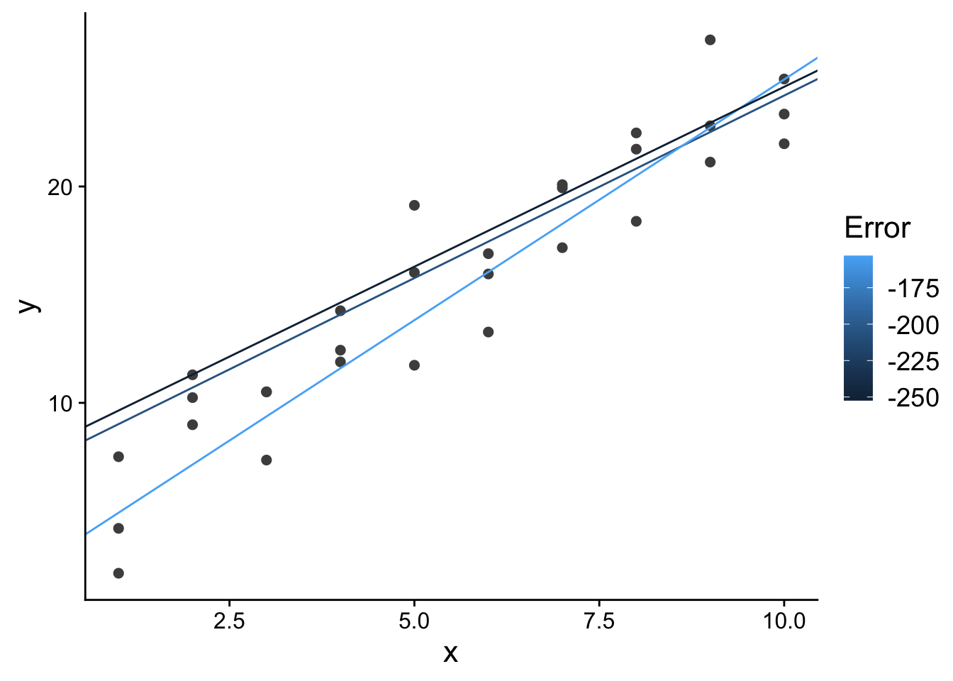
20.2.1.1 Model space
We could think of each model (defined by a1 and a2) as a point in “model space” (i.e., the space of all possible model parameterizations). That is, we could plot all 500 models we randomly generated according to their value for a1 and a2.
ggplot(models, aes(a1, a2)) +
  geom_point(
    aes(colour = -error)
  ) +
  scale_color_continuous(
    name="Error"
  ) +
  theme(
    text=element_text(size=16)
  )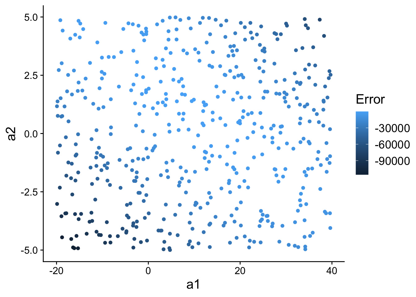
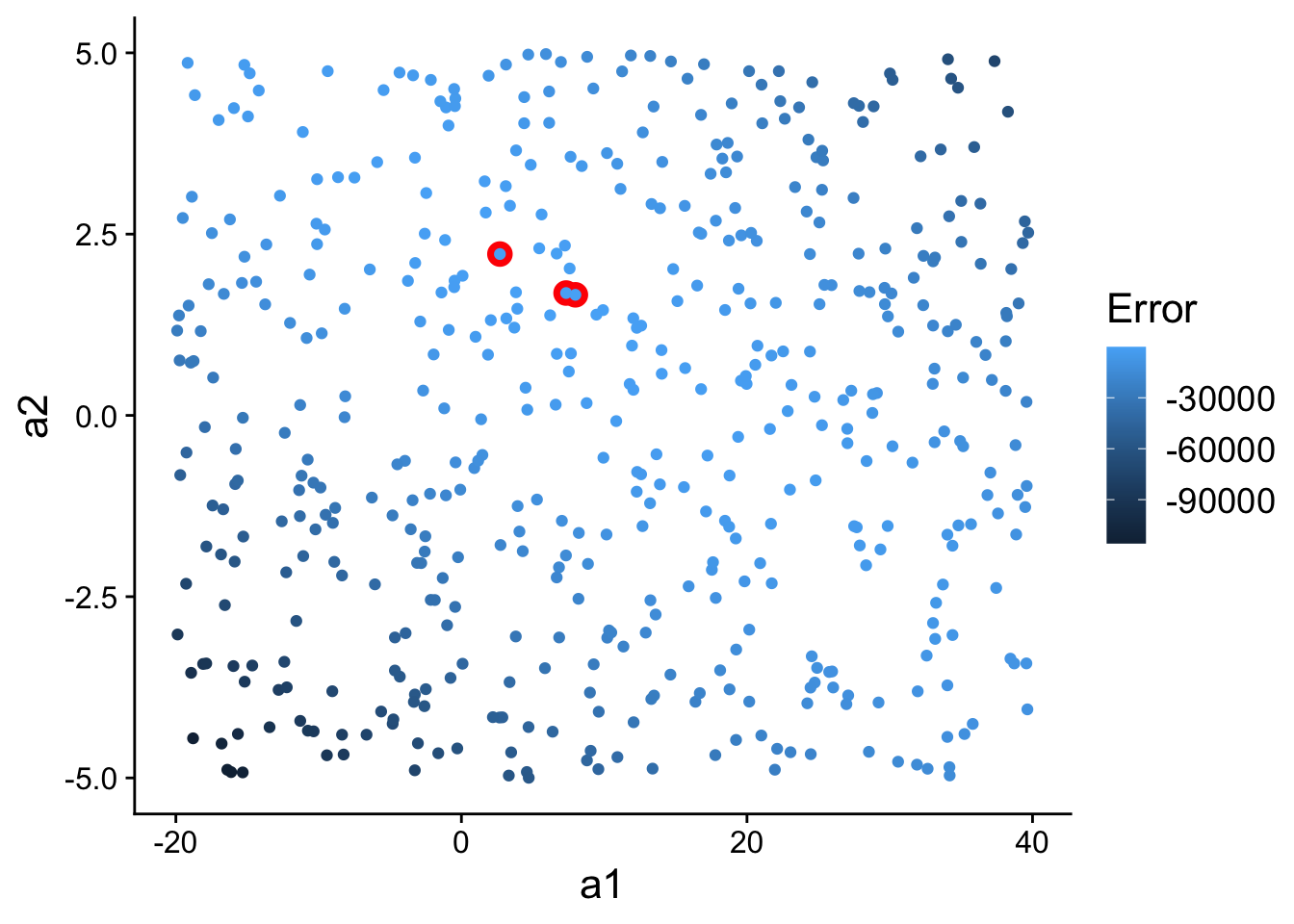
Now, let’s highlight (in red) the three best models we found in model space:
ggplot(models, aes(a1, a2)) +
  geom_point(
    data = filter(models, rank(error) <= 3),
    size = 4,
    colour = "red"
  ) +
  geom_point(
    aes(colour = -error)
  ) +
  scale_color_continuous(
    name="Error"
  ) +
  theme(
    text=element_text(size=16)
  )
20.2.2 More systematically searching model space for good models
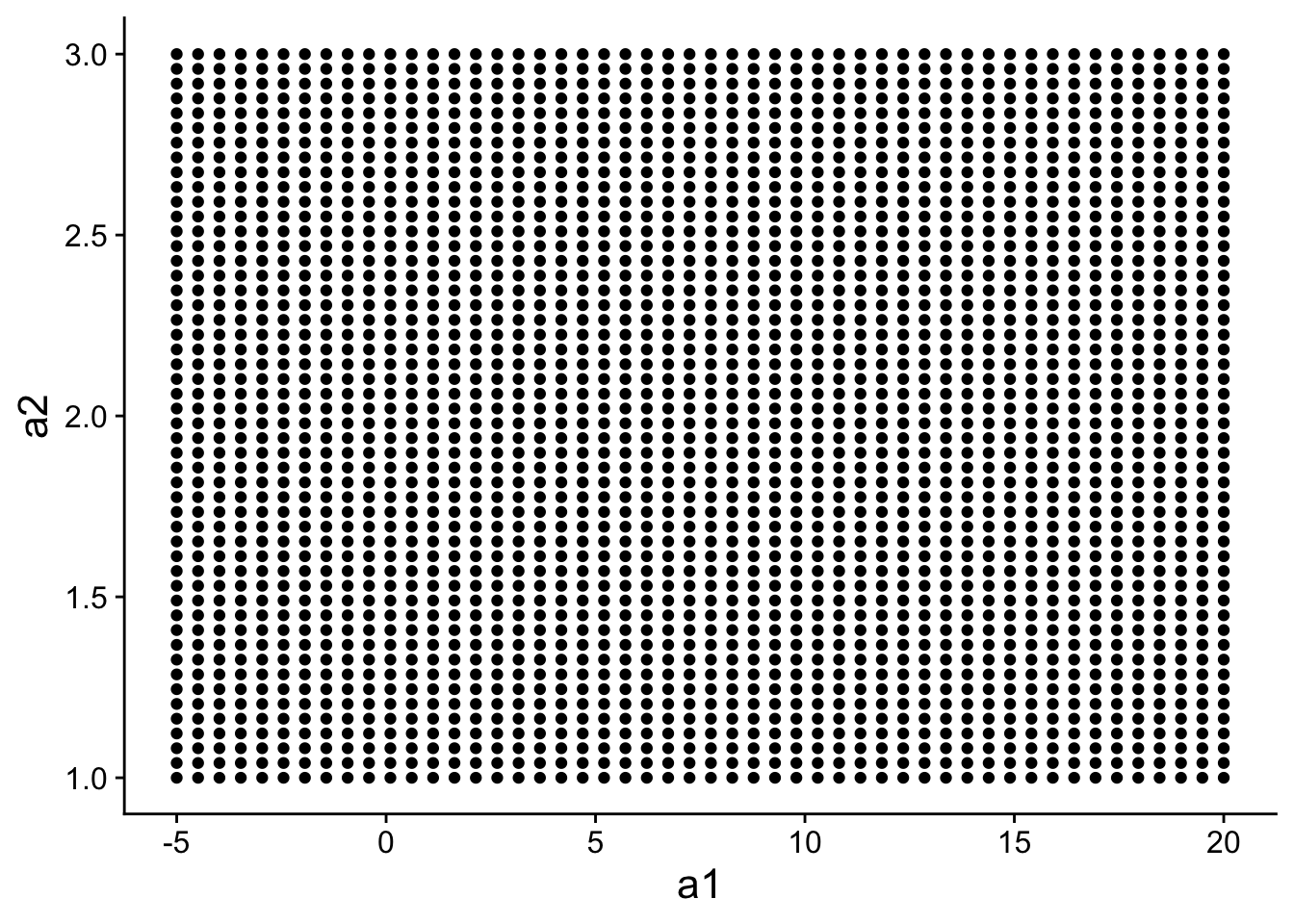
Instead of generating 500 random models, we could generate 500 models that are evenly spaced within some portion of “model space”.
grid <- expand.grid(
  a1 = seq(-5, 20, length = 50),
  a2 = seq(1, 3, length = 50)
)
head(grid)
## a1 a2
## 1 -5.000000 1
## 2 -4.489796 1
## 3 -3.979592 1
## 4 -3.469388 1
## 5 -2.959184 1
## 6 -2.448980 1grid has 500 evenly spaced models:
ggplot(
    data=grid,
    aes(a1, a2)
  ) +
  geom_point() +
  theme(
    text=element_text(size=16)
  )
We can calculate the error for each model:
grid <- grid %>%
  mutate(error = purrr::map2_dbl(a1, a2, sim1_err))
head(grid)
## a1 a2 error
## 1 -5.000000 1 7163.370
## 2 -4.489796 1 6711.865
## 3 -3.979592 1 6275.979
## 4 -3.469388 1 5855.711
## 5 -2.959184 1 5451.062
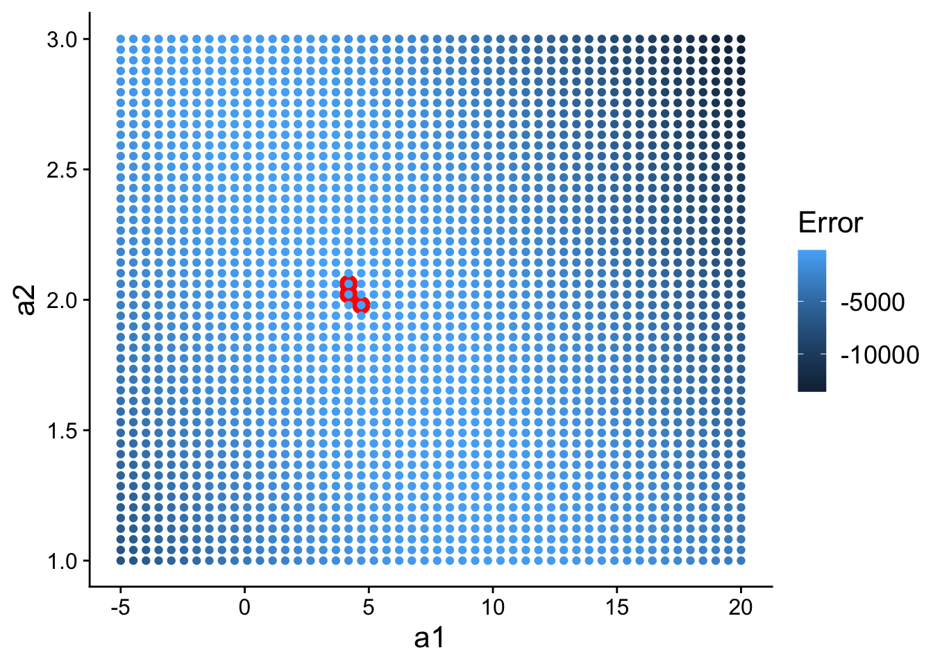
## 6 -2.448980 1 5062.031And then plot it, highlighting the top 3 models:
ggplot(
    data=grid,
    aes(a1, a2)
  ) +
  geom_point(
    data = filter(grid, rank(error) <= 3),
    size = 4,
    colour = "red"
  ) +
  geom_point(
    aes(colour = -error)
  ) +
  scale_color_continuous(
    name="Error"
  ) +
  theme(
    text=element_text(size=16)
  )
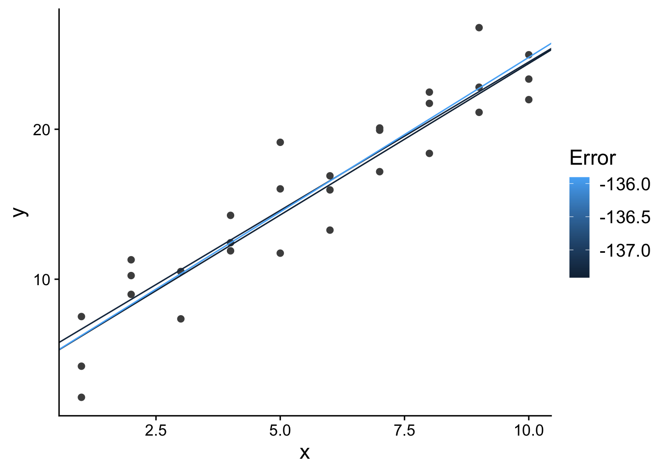
What do those top 3 models look like in terms of our predictor and response variable?
ggplot(
    sim1,
    aes(x, y)
  ) +
  geom_point(
    size = 2,
    colour = "grey30"
  ) +
  geom_abline(
    aes(intercept = a1, slope = a2, colour = -error),
    data = filter(grid, rank(error) <= 3)
  ) +
  scale_color_continuous(
    name="Error"
  ) +
  theme(
    text=element_text(size=16)
  )
20.2.3 Using lm for linear regression in R
Fortunately for us, we don’t need to generate random models or do a grid search in order to find good parameterizations for a linear regression model.
There are optimization techniques/algorithms that will quickly find good values for a1 and a2.
In R, you can use the lm function to fit linear models.
The lm function using R’s formula syntax, which you will want to familiarize yourself with: https://r4ds.had.co.nz/model-basics.html#model-basics and https://r4ds.had.co.nz/model-basics.html#formulas-and-model-families give good introductions to the formula syntax in R.
For example, to fit the linear model we were using to model the sim1 training data, we could:
lm_mod <- lm(y ~ x, data = sim1)
lm_mod
##
## Call:
## lm(formula = y ~ x, data = sim1)
##
## Coefficients:
## (Intercept) x
## 4.221 2.05220.3 Exercises
- Read through the R code. Identify any lines you don’t understand and figure out how they work using the R documentation.
- In the example above, we generated 500 random models. How would it have affected our results if we had generated just 10 random models? What about 10,000 random models?
- Look back to where we visualized our 500 random models in model space. What would it mean for the top 10 models to be in very different parts of model space (e.g., some in the top right and some in the bottom left)? What kind of data might that happen for?
- Look up multivariate linear regression. Then, look up how you could do multivariate linear regression using the
lmfunction in R? - Pick another regression approach that I listed in the overview of regression lecture. Look up what situations that regression approach is useful for, and then look up how you could do it in R (e.g., using base R functionality or with a third-party package).